
Before going into individual critiques the judges would like to take a moment to single out Simplicity, for their horrifically fitting patterns.
Nearly every outfit, both this round and last, that we thought has some fit issues, was made with a Simplicity pattern. While they hold the bulk of the blame, the judges do recommend test-runs with patterns. Making a muslin mock-up can help you preserve the changes you make, so that you can use the new, better-fitting, pattern again and again.
If you're lazy, we understand, but you can always take in the garment once it's constructed. This can make a dramatic impact to how the outfit looks on the doll, and suggest that you have a higher skill level (because you *will* have a higher skill level.).
CBSews
This outfit looked a little too close to the original inspiration. A more modern fabric choice could have done a lot to update it and make it seem more wearable for a girl today; the brown paisley ages the look a lot. Brighter colors in addition to smaller elements, like accessories, would add originality, though the ribbons, particularly in the back, and the use of the sheer fabric over the base, add visual interest, though, and make it more memorable. We just would have liked to see that taken a little further.
Sarah
Adding the tights was a really good idea; they bring the whole outfit together, and add to the 80's look, a look which happens to be very "in" right now anyway. Plus, the skirt is way too short, even for a mini skirt, but the tights reduce the potential for scandal. The polka dot pattern is a good scale for AG, but we think the top could have benefited from some straps. It's important to remember that the doll body is basically a rectangle, so things might not stay up over time. We also recommend taking a look at similarly constructed garments, even for people, before making something or considering the use of patterns (even simplicity, though again, pay attention to fit!). This can help you figure out how outfits are constructed for shape and support.
C.I. Fairfield/Childthursday
Looking at this dress, you can't really tell it's made of paper, and not just a very stiff fabric. It also found a great balance between inspiration and copy. The pleats silhouette, and color seem appropriate today, while the use of material, pattern and general concept are a bit mod. The trim, in particular, was a very nice touch; comparing the before and after pictures shows what an impact just a little bit of ribbon can make. The fit on the top is a bit wonky, though we're not sure if that's the paper, or a plump Sonali. And also, if it is the paper, well, it's paper. We also appreciate that she made a pair of shoes, and compliment her styling for the outfit.
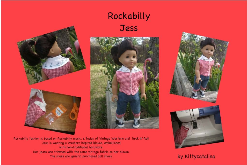
Kittycatalina
This is another one where a more modern fabric choice or color palette could have done a lot to update the look and make it less derivative of the original. Still, the styling is great, particularly the hairstyle, which is both period appropriate and super trendy at the moment. Technically, we wonder if this one was a bit rushed; the buttons are a bit haphazard, and the fit seems a bit bulky, perhaps due to the use of a lining over hemming? While washers aren't particularly innovative or original, they were used to good effect here, as flowers, with the appropriate leaf embroidery. The cuffs on the pants were also a nice detail.
Firinel
The skirt does most of the work for the outfit; the fabric is a great choice and the way it's framed by the pleats and brown tape at the hem uses it to its fullest potential. The Jacket coordinates well, especially with the repeated use of the brown trim (Bias tape?). That said, we think the simple shirt was a bit too safe. We think it needs just a little bit more, like a sleeve, or a collar, or a color. When the jacket is removed, the high waist *is* overwhelming, and the two pieces don't stand alone, though we suspect they could, while still looking fine with the jacket. The "untraditional" element was also a bit disappointing. Keys as a necklace aren't a new concept; these just happen to be in a good scale for AG's.
jchappa
Individually, the elements of this outfit wouldn't be out of place today, but we're not sure how well they work together. Leggings, or a less Celtic-looking embroidery may have helped update this more. We also wonder if a different color would have been a better starting point. The black looks a little washed out, and while it helps the embroidery stand out, it doesn't really coordinate with it. But, the lacework and the embroidery do look very nice, while the keyhole neckline adds some interest to the garment. The length might seem like an odd thing to single out, too, but this dress seems to fall at just the right spot on the model.
LJCatfeather
The collar and color are good references to the inspiration, but other details, like the lines in the top, might have been overlooked if they weren't explained for us. They're also overwhelmed by the collar. The skirt, while expertly pieced together, seems incongruous with the Egyptian them. A narrower skirt, or even more of a tunic with the leggings, might have worked a but better, while still not being to referential. The collar's use of nontraditional materials works great though.
Sewingmama
This look has a lot going for it: there's a lot of pieces, and they're incredibly well made, the colors look really nice together, and the zippers provide an interesting effect. The weak point, though, is the brown fabric used in the skirt and coverlet; it's a bit too heavy looking, and the cover is a bit drab. We wonder if a richer khaki or even a gray might have helped. Or even a plaid or a print? Still, the other colors work well together, particularly the underskirt and the leg warmers (great use of variegated yarn here!), and even the brown doesn't look terrible, we just think it could look better. The criss-cross effect with the suspenders in the back was really eye-catching.
Allicapri
This dress doesn't look out of place today, but we think it's more because it's so classically beautiful, than that there was much updating to the original inspirations. We are fully aware how terrible it is when the real Project Runway judges say, "You made a gorgeous dress! How awful!" and we know this could *sound* a bit like that, but we don't mean it that way. Mostly.
Still, this does feel like an "Allicapri original". Mixing the textures in the same color works brilliantly, though it might have caused some limitations to the materials, such as the lace at the waist being perhaps a bit too heavy? While the use of fake flowers on a dress isn't revolutionary, the floral straps truly contribute to the impact of the dress.
Seaflower
The red jacket almost references the inspiration *too much* but the rest of the outfit is just a t-shirt and jeans. Something like breeches-inspired capris could really have carried the look through the outfit, and allowed the jacket to be a bit simpler (maybe a cap sleeve) while still medieval-y. The fabric choice was very nice here. The red print looks modern, especially when combined with the black. Careful in posing your photos though, the way the arms are out makes us wonder how well the jacket fits, and the jeans have slight bit of cameltoe. Pressing the jacket could have also helped it look neater and more fitted.
Heritage4
The styling, particularly the hair, really helps this look shine. Without the corset, the grey ribbed fabric and the blue fabric don't seem to blend well together, but the untextured white fabric really brings everything together, and completes the look. The gathering on the skirt is an interesting effect, but we're not sure if it achieved what it was going for. A slightly longer skirt might have helped the effect stand out, and we wonder if the unaltered skirt might have been made a little too short in the first place.
numberonekitty
We love that the shirt uses details, like the tiny neck and sleeve ruffles, and the lacing to really reference the original time period, without overwhelming a modern outfit, but wish we would have seen similar in the capris. Choosing capris over shorts or pants was a start, since they're sort of like breeches, but a cuff or button or something at the bottom could have been really clever. The purse, while it was an original use of materials, but it doesn't seem to go along with the rest of the outfit. We get that kids won't really coordinate their purses with outfits, but the "unconventional use of materials" seems like a bit of an afterthought.
Holley
This look is a little too costume-y, and we have trouble picturing a 9-13 year old wearing it to school, with the exception of the belt, which is pretty on-trend and modern looking. The neon colors do look really great on the black and white though bending the paperclips somehow might have been better, since they still look like paperclips. Choosing to edge the black collar was a good choice. Hemming might looked a little cleaner, but it also might have made it too big, or affected the way it hung, plus the circle shape would have made it difficult. Pressing the outfit might help in the future. The fabric puffs out around the seam in the back, which affects the way the rest of the outfit hangs.
StellaKelly
Lots of pieces, here, which suggests a lot of work, but there's a little too much going on. Editing it a bit might have been a great idea, since a lot of the pieces look really great when you focus on only that piece. A third major color, or replacing the orange or red with a color further away on the color wheel, could also have helped visually separate the pieces from each other. We do like the way the bright blue, in the flowers and glasses works with the red.
Gomunk
While this is a very pretty dress, it seems more like a dress-up outfit than anything a girl would wear, even to a formal event, like as a junior bridesmaid. The blue overskirt brings to mind Cinderella, though the ribbon edging looks great. More details like that, and the lacing and the beading, could helped modernize this. Changing the sleeve from the pattern was a good idea, but we think you could have taken it even further, by removing the sleeves altogether, or shortening them. The neckline is one of the dress's more modern detains, but its wide shape combines with the puffy top of the sleeves to make the doll look really wide in the shoulders.
thelight139
The judges did a lot of back and forth on this one! Similar looks were really popular in the 80's, but those looks were themselves inspired, even if loosely, by Regency fashion. The high waist, white eyelet and short spencer jacket were all things that were popular back then and have resurface to time, which this outfit makes good use of, but we wish there was a bit more of the designer in it. The pop can tabs were innovative and original, but other details, like contrast stitching in the jacket or dress could have really made this stand out more. Still, the dress fits well, and looks very nice on the model.
the1butterfly
This has a really original inspiration, but we wish it looked a bit more modern. A different color/fabric choice or a shorter skirt could make this a fun easter or summer dress. The top, especially with the versatility of different sashes, though is interesting and very pretty, though the bottom and back could have used more pressing. The untraditional material was way outside of the box, but it doesn't seem to add much to the look. We also question whether human body parts are ever appropriate for clothing, being reminded of the time one of the Project Runway contestants used hair in their in their final collection. It's almost a little too strange.
prncssme
On first glance, this is a classy, simple look, but the details are what really make this shine, though they're almost too easy to overlook. The embroidery on the pants, and their very straight cut, for example, can be seen as a reference to pantalettes, once its pointed out, though capri or flood length bottoms would have been an even clearer reference. The asymmetrical hemline of the shirt keeps it from being just another tank top. The wiring detail on the jacket also looks like part of the outfit, not just a random broach or jewelry piece, which brings in the hairpiece as more than just a headband.
Curiouser
The inspiration here is very clear, even if the process was a bit backwards. The colors look very well together, and grey and red aren't something you see together every day. The print, too, is just gorgeous, a great choice. The judges are disagreeing, though, on whether or not the overdress works best, as-is, in four panels, or if it would look better as a more solid overdress, though they agree that the skirt might be a smidge too stiff. The designer might have been going for an armor-look, but kids can be really sensitive to the way fabric falls around them, and dislike things on that alone.
Showing posts with label judges reviews. Show all posts
Showing posts with label judges reviews. Show all posts
Sunday, March 28, 2010
Friday, March 19, 2010
Judges' reviews, round one
Hey guys! Remember to have your votes in by tomorrow night! Thanks bundles!
Link
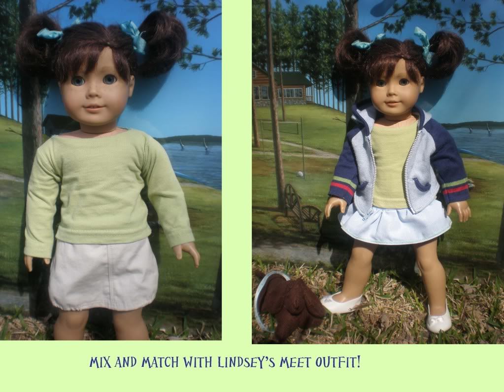
This does seem like something Lindsey would wear, but we’re not sure how much it adds to her existing collection, because it is very similar to meet outfit. The leggings remind us a bit of her tights, plus she came with a light jacket and skirt. Pants might have been a more original choice. The styling with pigtails and bow tie shows, along with the color choice of the jacket seem more appropriate on a much younger girl, though we do think the basic design of leggings, skirt and shirt are perfect for a 10-14 year old girl.
Lindsey's In Like a Lion outfit by C.I. Fairfield
Link
There’s a high skill level here: very nicely finished hems, topstitching on the jeans, and a bias on the sleeves for the coat. However, the fit for the coat and the pants seem a little large on Lindsey. We were a bit overwhelmed by the coat, but wondered how it might look if it wasn’t so crisp and bright, and found that the mental image works a bit better. We all actually liked the prototype outfit more, and thought it was more suited to Lindsey. We understand why it was changed to match the coat, for a cohesive look, but we’ll also point out that 10 year olds just tend to wear whatever coat their moms get them.
Lindsey's volunteer outfit by gomunk
Link
We like that this look incorporates the story, but wonder how realistic it is. Would she really have a lab coat, or would she just have grabbed an old pair of jeans and tshirt? The outfit is really well made, and the bright red of the pants seems to match Lindsey’s aestethic, but the black scrub top, while cute, seems a bit dull for Lindsey. The hat is a nice, but pretty unnecessary addition. More photos or a bit of an explanation could have changed our minds.
Kailey's Ocean Outfit by seaflower
Link
This outfit was hotly debated by the judges, but there are a few things we agreed on. The purple fabric was a nice choice, but the teal seems to overwhelm it, particularly in the thick belt. The theme of the outfit was taken a bit too far between the shells as a necklace, as a hair accessory and on the belt, one would have been enough-or we’re getting distracted by the shells in the photos, too. Scale might be factor too, the shell on the belt would have to be very large on a real 10 year old girl. The “petals” and their edging give the outfit a really airy quality, that works great for Kailey though.
Note:
The Folklorico Costume was probably the most obvious choice for this challenge, but it was interesting to see the different takes on it. We did some research on the costumes in preparation for judging, and will be considering practicality, along with accuracy.
Marisol's Folklorico Outfit by katydid
Link
The skirt on this seems a bit narrow for a Folklorico costume. White, though, was the most common base-color used for the costumes that came up in our research, so we know this is somewhat accurate for the color choice. The ruffles on the camisa look nicely done, but we wish it would have been pressed a little better or even top stitched, since you can see the seam in some photos.
Marisol's Folklorico by Heritage4
Link
The zig-zag design makes this look stand out, but also causes a few problems. It looks amazing when it’s spread out and was expertly done, but we wonder how it would look in motion/twirling, and how much deviation is allowed from the traditional costumes. Our research didn’t turn up anything like the point-design, but the colors and the fullness of the skirt seem to be very accurate. We wish the skirt was gathered or centered a bit differently, because when it’s just falling naturally, the points of the design look uneven. Despite the issues, though, this look has a lot of artistry to it, and innovation.
EDIT: So it's been pointed out to us that our five minutes of Google and Wikipedia research were fail, as this type of pattern is sometimes found on folklorico dresses. So that's our bad, and well done, Heritage4.
Marisol's Folklorico Dress by jchappa
Link
This is another skirt that is probably a bit too slim for Folklorico. It isn’t exactly narrow, so the fullness was clearly a consideration, but we wish the designer went just a bit farther with it. The use of lace and the sash in a contrasting color adds a good design element that puts a personal interpretation on it, while the color choice and ribbons along the bottom follow the more traditional route. We do wish the lace at the top was a bit narrower as it feels matronly, but that might have been a selection issue.
Marisol's Folklorico Outfit by ljcatfeather
Link
This Folklorico outfit had the most innovative use of color, while still being pretty traditional. Our research didn’t turn anything up in this exact shade, but there were very similar pink and purple colors used. Since there’s so many different ribbons used in this one, you can guess that it was pretty labor-intesive, but it looks pretty well done, particularly in the top and sleeves. The colors of the ribbons and embroidery work very well with the base color.
Marisol's folklorico outfit by Tink
Link
The choice of base fabric works well here, as well as the combination of ribbons and embroidery; also the choice of fabric gives it a good, light look. The “lightness” of the fabric lends itself to a dance costume, though we wish she would have amplified the crinckly effect even more by twisting it and wetting it. (Try twisting and wrapping in a stocking, then running it through the wash.) The skirt falls a bit oddly, as well, and we would have liked to have seen even more color in this.
Nicki's Casual Outfit by numberonekitty
Link
We had a hard time finding any concrit for this one, we all like it so much! Our one suggestion is that the green top on the dress might be a little bit large for the scale of the dress. But overall we absolutely love this one. Great fabric choices, good design; everything works together without being too matchy match. It fills a need and works for the character, and looks appropriately local; we can also tell you put some thought into your outfit. We also like the smaller details you've included, like the detail on the seams where the tiers come together and the small buttons on the vest, which we think are a great embellishment without being too much. We love that the vest is lined. Good job!
Mia's Nelda's Notions Warmups by Holley
Link
We like the idea and it's another one with a lot of thought put into it, though we suspect it won't be a major vote getter because it isn't showy. Love that you thought about getting it on over skates, and the reasoning behind your choice of colors. Major bonus points for the patch as it must have taken a lot of work. It's not perfect but we're still very impressed. We like the racing stripes on the sides and the pink lining, and how well it goes with the silver skate outfit. We do think the waist looks a bit bulky and aren't sure whether that's due to the skirt under it or not; a photo sans skating outfit might have been helpful just to show the fit better. Also, the hood is a tad pointy, but we realize hoods are hard!
Mia's sugar plum faerie skating outfit
Link
First off, there was obviously lots of work on this one, and they were probably difficult materials to work with. So nicely done there. We all think the top needs an editing eye - there's just a little bit too much going on, especially with all the braiding ever. Just take it down a notch next time. We like her styling. We do question how easy it would be to skate in this.
Also, we question whether this truly fulfills the challenge, since we said that if you add something the character already has, you need to convince us that it adds something to the collection - and I'm not sure you did this. We even specifically mentioned Mia's collection and skating dresses as an example here.
Mia's purple and black casual outfit by thelight139
Link
There were parts of this outfit we really liked and that we thought were well done and other parts that we didn't like so much at all. One of our main points of confusion was not seeing how this was an outfit for Mia. It didn't look like her style or her color palette, and doesn't look young or fun. It might make a good JLY outfit but it doesn't really "fit" Mia. We also wish it was in two pieces instead of one. The hem looks really wide, and it could use more accessories. Things we did like include the cute skirt, the detail on the neck, and the black pockets (although one judge suggests that they don't line up quite right with her hips). The edging on the arms helps connect the skirt to the top. We wish she wasn't wearing the scarf; it doesn't add anything and does hide the cute neck.
Chrissa's sundress by Sarah
Link
This is a good first attempt without a pattern, we like the asymmetrical hemline. However, it needs to be hemmed at the bottom, and your top hem needs to have smaller stitches on it - it looks bad and it's likely to snag and break. You can also see the selvage on the back of the dress, which is a big no-no. We're slightly confused about why you made it for a character with boobs, as your doll certainly doesn't have them and we don't think Chrissa the character did, either. The fabric selection is good for Chrissa. Styling-wise, we like the color on the boots but they look like winter boots and therefore maybe not outfit-appropriate.
Chrissa's winter outfit by Allicapri
Link
This outfit fills a definite need, and looks like something Chrissa would wear, especially the blue (maybe not the black quite as much but it works with the outfit). We absolutely love the headband, think it looks great and is very well done. We also like the coat although it doesn't really go with the outfit - but most ten year olds probably won't have a matching coat, so it is realistic. We wish the pants were just a little more fitted, but bravo on doing dolly pants. We do think the puffy sleeves are a bit distracting. We also kind of wish the long sleeves weren't faux to give it mix-and-match potential, but this is well in keeping with what AG has been doing lately.
Sonali's Spring Mix-and-Match by sewingmama
Link
Very serviceable. The shrug is definitely our favorite piece, and the bright color palette fits Sonali well. We like that you did pants that weren't blue jeans to offer variety, since she already has her jean capris. There isn't a lot of WOW to it, basic pants, basic tshirts, another addition like the scrub might make it more memorable. A photo with teal shirt and shrug might have helped.
We do wonder what need this fills and how this is for Sonali (although it does look appropriately styled and colored) since what it seems like is "Sonali has no clothes. Here are clothes."
Sonali's Mix and match by Livien
Link
It's nice that you've made a lot of pieces, but there may be a bit too much going on here. We would rather see two really interesting, well-made pieces than ten not as interesting, not as well made pieces. There's just a little too much going on here for us, though we think it might have helped to see all the pieces laid out together in one photo. You also have a couple of wonky hems, on the turtleneck and the skirt hem.
We do like your color palette, which goes well with Sonali's meet outfit without being derivative. Well done on the swimsuit, which we're sure was a pain to work with.
There was some dissent in the ranks on the next two outfits for Sonali - we know a lot of folks really wanted to see an Indian outfit for Sonali, but question the inclusion of it since there's no evidence that Sonali the character ever wore traditional outfits - where would she wear this? Especially for a kid concerned about fitting in. On the other hand, it is conceivable she'd have things like this and is fun to imagine. The bottom line is, though, we question whether traditional pieces have a place in Sonali's collection.
Sonali's kurti and pants by SailAway
Link
We appreciate that the fabric was probably difficult to work with, so well done. We also like the lacing in the sides which adds a touch of design while still relying on the traditional elements. It's a good fit. We like that you made accessories for a head-to-toe look, but do think they're a little bit large in scale for 18" dolls. A couple of judges question the pants, though; one suggests that modern kids might wear the kurti over jeans, which might give it a more character- and age-appropriate look.
Sonali's Pattu lehenga by prncssme
Link
This is accurate as far as we can tell from our minimal research. Great colors, especially for Sonali, and we like that you took what was otherwise a fairly generic, if pretty, brocade and placed the pattern in different ways at the waist and in the skirt, sleeves, and scarf. We also think that the beading adds a huge wow factor to the outfit. One of our mods is impressed that you got the hem to hit perfectly at the floor.
We would have liked to have seen more detail photos (notably at the waist, since we're having a hard time telling how the fit is there) and used slightly less artistic angles on your photos.
Lanie's jumper outfit by the1butterfly
Link
We're having trouble seeing this as a Lanie outfit. The colors aren't really her style and are washing her out, and it doesn't really look like a current outfit. In general, she seems fairly preppy. The dragonfly is excellent and a very “Lanie” touch. We also love that you used recycled materials; Lanie would approve. And we think the roses are a good choice for her as well, albeit maybe not in that color. We do like the silhouette, especially the middle belt. But it looks a bit crooked (measure twice, cut once! Press! Not in that order!) One of our judges loves the shapes in the skirt but wishes they were a bit more symmetrical.
Lanie's Gardening Outfit by Firinel
Link
Great Color choice, green and blue look amazing together, and very Lanie. The fabric choice is very good with the tie-dye, and we like the pants...or at least what we can see of them (we wish we could see the top in one of the photos. It fits right in with Lanie's collection.
However, we have the same concern that we have with the Mia skating outfit above. What does this add to Lanie's collection? She already has a gardening outfit, and we question whether this is better, as it looks hotter (jeans? Two layers on the top?) and doesn't have a useful included hat (we do like the useful included kneeler, which Lanie might wish for when wearing white shorts).
Lanie's Boston sports team outfits by Curiouser
Link
The navy tshirt is particularly clever and reaslitic, and modern, but the white tshirt's saying does evoke baby onesies, even without knowing it was one. Good for a recycled materials challenge. We don't know if Lanie is a sports fan at all but we can imagine she is.
Subscribe to:
Posts (Atom)