It's the last round! We'll be taking a look back at all of the work you've done for the contest, and voting and distributing points based on everything.
If you entered any rounds, you're eligible to earn points here. You have the option to email me the links to the two hosted photos you’d like to be displayed in the Final Collection review entry, in addition to links to your albums for every entry. If you don’t email me this, then I’ll choose your highest scoring entries, and if there’s a tie, I’ll choose which I liked best.
You can also send me a list of the album links, which would save me loads of time, but otherwise, I’ll be pulling the links to previous entries from each rounds posting. If they’re gone or moved, just include new links in your email. If you have deleted albums, and don’t want to re-upload them, you can send links to the a single photo of your outfit, and that’s what will be included.
Essentially, I can only include what I have. If you forget to send all this, but your past links all work, then you’re fine. But, if all your links are broken, I hold no responsibility for that.
For the final review, we will be voting and picking judges picks like normal, however, each will be worth 50% extra points, with half points being rounded up to a whole (ie, third in votes is normally worth 3 points, so third in the Final review will be worth 5.)
In addition to the Final Collection Review, however, you have the option to go back and revise a single entry. You can start from scratch or merely add a pair of leggings or whatever. You can consider your critique for that round, but we do not expect.
This Revision is worth the same amount of points as a normal round, including the option not to do it, and the single point for actually doing it. Voting and judges picks will proceed as normal.
If you do the revision, a frontal image must be one of the two photos you choose to display on the Final Collection Review. Send your hotlink and album link, just as you would a normal round.
Also, if you have an etsy, an ebay account, a store, or even just a posting on PT or your livejournal, include the link! I’ll include it with your collection and maybe even its own entry!
Links and the Revision are due by midnight, PST Sunday May 9th, and will be posted as soon as possible, but likely Monday evening/night.
Wednesday, April 28, 2010
Saturday, April 24, 2010
Bean's Judge Pick
My judge pick this time is LJCatfeather's outfit. Bulleted list!
- I REALLY love the skirt construction. It's fluffy and flowy, and the corseted top is a nice top.
- I liked the human clothing recycling
- Dying! That's an impressive amount of hard work!
- The color scheme is really cohesive.
- I REALLY love the skirt construction. It's fluffy and flowy, and the corseted top is a nice top.
- I liked the human clothing recycling
- Dying! That's an impressive amount of hard work!
- The color scheme is really cohesive.
Thursday, April 22, 2010
Mars's judge pick, round 3
I was having a hard time picking for this round...I thought maybe I'd see what the other judges picked and whether that nudged me in any particular direction. But...each of my favorites now has one pick. Dang, that doesn't help at all. So I have to make a real actual decision.
I am going to concur with Angry Jess (gulp) and pick neohealy's outfit. When I first saw it I wasn't sure if it was something the kids were wearing these days, but I thought if not you could certainly market it. I'm now informed that the kids are totally wearing this, or at least a certain type of kid, so well-done with the trendy here. I think you did a great job with the art on the shirt - it looks neat and clean, especially from a distance (clever art design, too - very clever). I know I would have blown about three t-shirts before I got something like that right.
The rest of the outfit comes together really well for me, too. It looks like an outfit, it fits the theme while referencing the original, and it's just darned cute. I also love the little bag accessory. And the suspenders which really add just the right level of interest to the top for me.
All in all, very cute. I kind of want one for myself even though it's not my personal aesthetic.
Wednesday, April 21, 2010
Supernonamegirl's pick, round three
There were so many factors in this challenge, that judging was very difficult. We almost bounced the challenge at the last moment, even, just because it was so hard to quantify too close to the original or too far, but decided the three rule would be good enough. I think it succeeded, because there was still loads of room for interpretation. I do think some lost their own voice in the references, while others were almost too loosely interpreting. So, naturally, I'm choosing the one that I think is the best combination of both: numberonekitty!
Using the same base color could have backfired in a big way, but she changed up enough other elements to really distinguish it from the original. I love that she researched time-period appropriate fashion, and the collar was the perfect way to reference the godawful thing on top of the original. It's classy and really adds to the dress.
The belt was also a great addition, breaking up the green and white, so that the eye isn't overwhelmed. The white trim adds even more interest. Remove any one of those elements and this dress doesn't work as beautifully, if at all.
While I do feel still feel a bit more like it's a Kit dress, especially since it's not full like original, I also agree that Ruthie might not have wanted to flout her wealth, and I'm willing to let that side.
Round three voting results!
Third Place

Sweet Melody by neohealy
Second Place
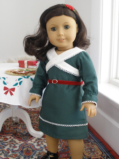
Ruthie's holiday dress by numberonekitty
first Place
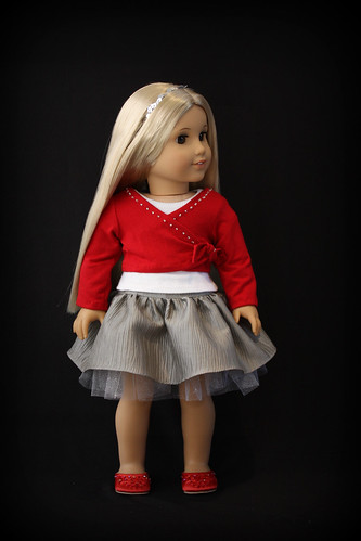
Sweet Sequins by Heritage4

Sweet Melody by neohealy
Second Place
Ruthie's holiday dress by numberonekitty
first Place

Sweet Sequins by Heritage4
Sunday, April 18, 2010
Neohealy
This look, particularly its color scheme looks a bit 80's, but in the way that seems to be "in" right now. Using the roll of tulle was very clever, but we wish the skirt had a few more layers to it. A handmade shirt would have been better, and would allowed more freedom in the design, because we're not sure that an ordinary tshirt is the best choice for the rest of the outfit. The t-shirt design is really cute, but we think it might have looked neater with a different method, like tshirt transfer paper or puffy paint. Still, the details, like the suspenders, purse and rhinestones added a lot to the outfit, and show a great deal of potential!
Kittycatalina
This outfit is a little uneven, but has some really great aspects going for it.. The shirt is very nice, fits well, and looks very wearable. The vest, on the other hand, is a little too bulky and doesn't seem to fit well. The yellow could have been a little bit brighter, without looking like rainbow throw up, but we do like how the parts of the design stayed with black and white and grey. The pants look like they fit really well and the cuff was a nice touch, but the pocket is placed peculiarly, way too low for most cargo pants and inconvenient to dig down into.
seaflower
This is definitely an improvement on the original, but the judges wonder if some fashions of the 1900's were just too...much for the modern eye. Past research indicates super thick collars were in fashion at the time, but here, it overwhelms the dress, and looks out of scale. We're also not sure that iridescent blue/violet fabric existed in the 1900's but that's never seemed to stop AG before. The underwear was a great addition, though, and might have even made the original better! The full skirt works well here. We also adore the sleeves, and like the use of the same color ribbon or fabric strips for accents.
heritage4
This is a design that you could definitely recognize the inspiration from, without it being even remotely similar. The references to the original were used to great effect. We love the skirt, particularly the top, so much that we wish it weren't covered up by shirt! We also wonder if a slightly darker shade would have complemented the red better, but that might also just be photo issues. We're a bit more torn on the top, though, and think the knit fabric looks a bit too casual for the skirt, though the shape and shade work really well. The silver beads are a great touch though, that add a lot of class to it.
ljcatfeather
The skirt is a really interesting piece, and such a great color. Hand-dyeing it was a great idea, and really paid off. While the final product looks really nice and wearable, the judges do wonder if the skirt took up too much time. Some details, like the ribbon on the shirt and even the shirt length, seem a bit uneven and messy. Likewise, the shrug has a bit of an odd fit in the arms that is a result of making it one piece, instead of separate pieces for the bodice and the arms. We also wish it was slightly more referential to the original look, even in terms of color or the shirt style. Still, the designer took their time in photographing it, and the final outfit does look very nice together and wearable. We just wish we could have seen the same high skill level and attention to detail that was shown in the skirt in the rest of the pieces.
jchappa
The judges never would have guessed that pink would have made an AG outfit better, but this palette was a definitely an improvement, particularly the yellow. While we do like the empire waist of the dress, we think a different shape might have been better, this seems like it could use something to hold it up. We also think the lace cardigan was an interesting choice and very nicely designed, but wonder if a 10-13 year old would wear it any more than the original jacket. It doesn't seem like it would provide much warmth, and still looks a little matronly. The judges disagreed a bit on how well the hairclip worked with the rest of the outfit and the use of buttons, but did agree that adding the accessory was a nice touch.
Holley
We think the shirt is a much better color and fabric for Ruthie, but it fits strangely and looks a bit lopsided. That might be just the way it works with the shorts, and why Nicki's meet top, which was a similar style, was that peculiar unitard-thing. While including the hat was a good way of referencing the original, we think this style looks a bit too young. We do like the decorative stitch on the collar, though, and it seems very "Ruthie" and the belt loops, though a small detail, were a great choice and really make the shorts look realistic.
the1butterfly
The way the designer uses black here, or more accurately, white and purple with black, was ingenious. The stars pop out and add a lot of character, while the purple accents it well. We understand your hatred of animal prints, but wonder what zebra might have looked like as the fabric under the lighting. It could have added to the effect. We do really like the theory with the lighting bolts, but we're not sure how well they work in practice, since they rely so heavily on movement. We also think they clash with the stars a bit. Choosing one or the other might have worked better, and lighting bolt-shapes in the bodice wouldn't have relied on movement as much. Still, this is a much more innovative design than original and took some interesting chances.
allicapri
On a technical level, this is fantastic. The vest fits well, there were great color choices, and it is more practical than the original outfit for the intended activity. It just looks a lot like the Wilderness Outfit, with a striped shirt, brown pants, and vest. We think one way to change it up a bit, while still referencing the original is to include some more "southwest" elements. While a leather vest might be over the top, one more decorative than for warmth could have done a lot. A third color could also have livened it up a bit.
numberonekitty
This was a hotly debated outfit for the judges. We love the design, and the historical research really shows, but it somehow seems more suited to Kit than Ruthie. A fuller dress, like the historical inspiration, might have been better. We also love the collar, thinking it's a wonderful design and definitely an improvement on the original, but wish it was slightly more accurate to the illustration, which seems to go down to the waistline, instead of right under the arms. Despite that, this was a great color choice, for Ruthie, and vastly superior to the original.
Gomunk
This a key example of where the more photos, the better. The finished seams on the inside look very nice and show a true sign of a professional! We wish would have seen more of the designer, particularly in the jackets. It looks unfinished without buttons, and that was a lost opportunity for personality, but even contrast stitching or other decorative details might have helped. Lots of denim was a good choice for the 90's, though, and the pants seem to fit very well. The collar on the jacket, which can be tricky, also looks very nice.
Childthursday/ciFairfield
The designer made no effort to hide the fact that this was a bit of a rush job, and the judges can't help but wonder how it might have turned out other wise. The blouse is very, very nice, particuarly the pintucks and fullness of the sleeves. The design falls apart at the dress though the trim is still very nicely done. The skirt is really uneven, and the bodice needs to be taken in drastically. It's a fuller bodice, but not that full. Still, the judges can tell there was a good foundation. The inspiration was interesting and the fabric choice is better than the original. We also like how she retained the original colors, but flipped them, putting the pink stripes on top of plain white.
prncssme
This design seems to consider the intended wearer a lot more than the original. Green looks fantastic on Felicity, and this fabric is very nice. The bodice is still a bit busy though, eliminating the buttons/jewels might have helped tone it down a but. We also wish she had more of a cap, for properness; the feather is not quite enough. Still, the polonaise option shows a great attention to detail, not to mention versatility, and historical accuracy. It was a great choice to add that.
Curiouser
This is a much better shape than the original, the skirt looks a lot fuller and the longer length works well, while the vest adds a lot to the simple t-shirt. Making the skirt into a broomstick skirt was also a really good choice. But, we do think there might be too much green going on. A second color, even white, would have downplayed it a bit. There's also not a lot do with music, which was the original point of the outfit. We do really like the piecework in the skirt, though, and the placement of the graphic in the t-shirt.
Angry Jess' Guest Judge Pick, Round 3
The other AGPT mods told me I couldn't make fun of anything as a Guest Judge. Oh ye mods of little faith, you ever fail to understand my sensibilities. Because, really, think about it: why would I mock creative improvements on AG fashions? After all, I hate most everything AG makes.
Frankly, it's hard to choose a winner for this round because I think everyone who has striven to eclipse the concepts cooked up by AG's fashion designers is made of awesome and win. But a winner must be chosen, so I spent several Frangelico-fueled evenings perusing the entries.
Now, we all know how partial I am to the skillful use of language and evocative imagery. Given that, I could have gone with the Safari Sundress because it made me think of storms on the savanna. Yay, thinking. I'd like to see that one on a real runway model, to determine whether lightning really does strike the crotch area when she moves. It would get ten gazillion extra points if it does. Likewise, since the narrative for the Rustic Ranch one used the words 'crotch gusset" a lot, it should get four hundred millionty extra points for that alone. The Flutter Flower re-do used the phrase 'pucker power' in its narrative, and that amused me endlessly...plus the devil is in the details on this one. I mean, tons of details, what with dying fabrics and such.
Truth is, I am partial to the outfits that demonstrate that the devil is in the details, seeing as how the devil is rumored to be a close personal friend of mine. (I won't comment on the veracity of that rumor). So given that, my pick is: Neohealy's Sweet Melody Outfit. Let's face it, anything anyone did to improve the AG original would be a boon to society, but this one took the concept up several notches. I am impressed with the creative elements that were added. Granted, there is room for skill improvement, but that is just one aspect of this competition. This outfit, it hollers hip and trendy tween -- which is a good thing since you're designing for hip 10 year olds. It wouldn't go on my hips, because I only use suspenders for bondage purposes. (Yeah, go ahead, pause to imagine the visual. Are you done? Okay, back to the outfit). The sheet music bag is a fun add-on, and I approve of the leggings (although the resemblance to Hefty Extra Wide Drawstring Doll Ass Bags was unfortunate in that one photo, but we'll ignore that since it's not a photography contest). The tulle skirt, while bulky in construction, is all over stores like Justice and the like. Or so I'm told; I don't even know. Lastly, while I am not one to own anything with hearts on it, I give 400 million points to the creativity element of the musical notation on that shirt. Although yeah, next time lose that tape and go with iron-on. We all know I'd rock that topless look with suspenders and tie in the one photo, but you didn't stick with that look, so too bad for me. I award 1500 extra points for a fun presentation photo. This one, it is my pick. So, yeah.
Thursday, April 15, 2010
Neth's Guest Judge Pick, round 3
Hey, guys, Mars here! I wanted to preface this with a quick note that we decided to have two guest judges for this round - one representing each participating community. The mod for AG>18 is Neth; the mod for AGPT is Angry Jess, who will be posting her pick soon. That said, here's the commentary from Neth and congrats to the winner!
So, as soon as I saw Round 3, three outfits popped out to me and stuck in my mind the whole time. It took a while for me to work out which one I liked the best, but I kept coming back to the redone Sweet Sequins by Heritage4 over and over and so I've picked it as my judges pick.
It shows vast improvement of the original--Gods know I don't care for pink!--without completely removing all elements of the original. You can tell that she took into account the original look. It looks beautiful and the colors go together well. And drafting the patterns definitely is a plus with me, because I've drafted patterns and I know just how hard that can be. The thing that I didn't like was that the wrap top was made of a more casual fabric--it could have been velvet to make it more formal. But otherwise, beautiful and skilled work. I'd love my own version of this--or at least, directions on making that wrap top!
--Neth
Sunday, April 11, 2010
Challenge Round 4: Formal Season
For this challenge, you're to create a formal outfit, inspired by a season.
We encourage you to interpret that however you wish, but here are some things to consider:
-Few 10-14 year olds are wearing formal dresses, so we won't consider the appropriateness of the style. However, we will still consider the cut and fit on the actual doll. We don't want to see a dress that emphasized the boobs, for example, because there are no boobs to emphasize.
-Consider staying away from the obvious symbols, like snowflakes for winter. Artistic interpretation can make your dress stand out more.
-Obvious colors can also be a bit boring, but at the same time, with nontraditional colors, you might need to explain why your winter dress is in Green and Yellow, and even with that explanation, people might not be able to look at the dress and think winter.
-You can still choose a historical look, but please specify if you do! We're still looking for modern designs that wearable today, by default.
-We're also looking for seasons, not holidays that occur within a season.
Bonus points are available this round, for using a technique done by hand. This can be something like Rouching, crochet, knitting, or whatever, so long as it's done by hand. Embroidery by hand will also count, but fancy stitches from your machine will not. The technique is optional, but it will net you two bonus points. Make sure to photograph and explain your extra technique.
Since this round deals with formal dresses, and hand techniques, however, you have nearly three weeks to complete it. Entries will be due on May 1st, Midnight, PST.
However, the final collection review & challenge will be posted around the 24th of April, so you may want to plan accordingly.
Round Three Entries

Sweet Melody by neohealy
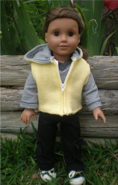
First Day Outfit by kittycatalina

Sam's Bridesmaid Dress by seaflower

Sweet Sequins by Heritage4

Flutter Flower by LJcatfeather

Lanie's butterfly outfit by jchappa
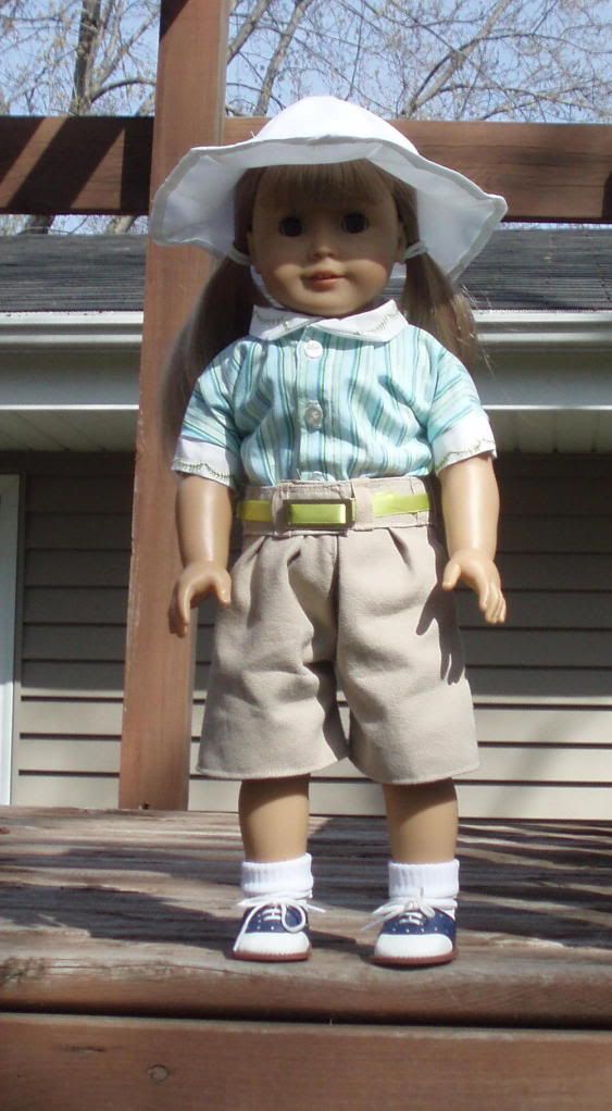
Ruthie's play outfit by Holley
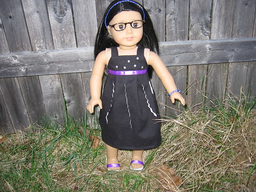
Safari Sundress by the1butterfly
inspiration gallery
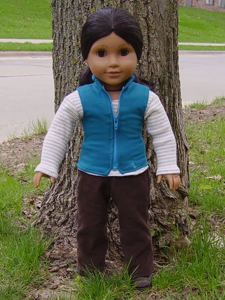
Rustic Ranch Outfit by Allicapri
Ruthie's holiday dress by numberonekitty
1996 Meet Outfit by Gomunk
Sam's Birthday Dress by C.I. Fairfield
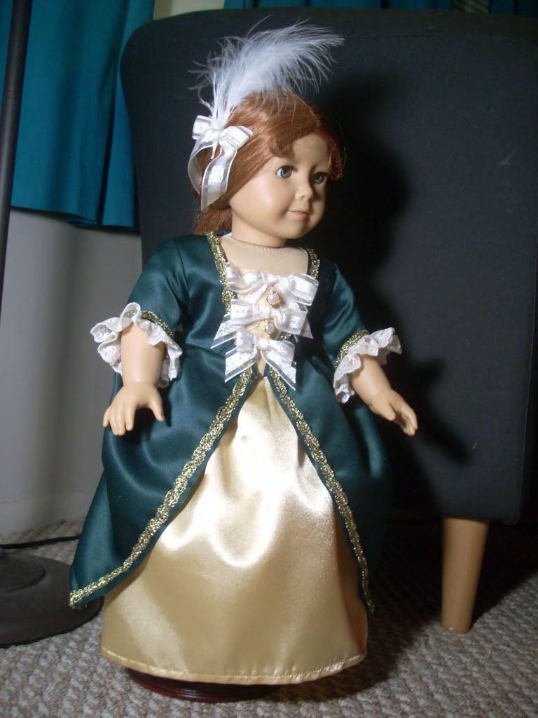
Felicity's Gala Gown by prncssme
Not eligible for votes:

Sweet Melody by Curiouser
Saturday, April 10, 2010
Creative Use of Materials!
It's a tie!
the1butterfly, for her choice of teeth. She thought really far outside of the box on this one, and it paid off.
and
Ljcatfeather for her use of electronic parts. The final effect looked like intricate beading, and it was really original idea!
You both get two points!
the1butterfly, for her choice of teeth. She thought really far outside of the box on this one, and it paid off.
and
Ljcatfeather for her use of electronic parts. The final effect looked like intricate beading, and it was really original idea!
You both get two points!
Bean's Judge Pick
My judge pick is Childthursday's paper dress.
I'm probably biased because I've always loved the 1960s paper dress, but there was also plenty of work that went into it. Childthursday didn't just say "PAPER!", she used coordinating materials, accessories, and several techniques such as pleating to get the job done. I'm also impressed that she sewed the paper without the machine eating her dress.
Also, shoes!
Supernonamegirl's Pick!
Generally, both this year, and last, a couple of outfits stand out to me from the beginning of a round, and I do tend to go to them for the judges' pick, but that didn't happen this time. There were some really great entries, but I didn't fall in love with anything right off the bat. As I was working on the critiques though, that changed and I really did fall in love with one of the looks. The details were what really made this outfit stand out, in terms of skill, inspiration, and originality. My choice: prncssme!
The jacket is easily my favorite part of this outfit, the Silouhette is very regency, while the color is simiply beautiful and a bit modern. The wire detail is also thoughtful, it doesn't seem tacked on. But, even the other outfit pieces, the pants, the shirt, and the headband, all are more than "just" a tank and pants and headband. The assymetrical hemline was a great choice, while the embroidery on the pants was a nice reference to lace or the decorative bottoms that would be found on pantalettes. And, the headband is something that I would wear, made out of electrical wire or not.
The jacket is easily my favorite part of this outfit, the Silouhette is very regency, while the color is simiply beautiful and a bit modern. The wire detail is also thoughtful, it doesn't seem tacked on. But, even the other outfit pieces, the pants, the shirt, and the headband, all are more than "just" a tank and pants and headband. The assymetrical hemline was a great choice, while the embroidery on the pants was a nice reference to lace or the decorative bottoms that would be found on pantalettes. And, the headband is something that I would wear, made out of electrical wire or not.
Thursday, April 8, 2010
Mars's Judge Pick, round 2
OMG, this round was hard, you guys. Really hard. But overall I liked thelight139's outfit best - it looks like if you took a regency dress, pulled it into the modern era, and made it really cute. I think the jean jacket was an especially nice choice and it looks good at that length. The dress is also beautiful - I love the fabric choice and it goes well with the jacket. I also think the belt with pop tabs was a great use of materials - not too obvious (meaning it's both creative, and it's not glaringly apparent that you've used something unusual in your work) and it's also used to add just a touch of interest to your work. Nicely done!
Wednesday, April 7, 2010
Round two peer reviews
I would have had this up earlier but I was on vacation. I think the list is identical to last round but if I missed anyone, give me a gentle poke.
Rule reminders:
4. You can do these in a judge style the way we do, or not - totally your choice.
Gomunk
Fin
Allicapri
Sewingmama
Curiouser
jchappa
heritage4
Holley
prncssme
Stellakelly
Seaflower
numberonekitty
If you weren't included in the above list but would like to be, you can comment below or email us and we'll edit it in (it's totally okay even if you miss the deadline; it just means you'll be added later).
Rule reminders:
1. No flaming. Duh. "I hate it" is not helpful to someone. Try to keep all comments helpful to the sewer.
2. To that end, for every negative thing you say, try to add something about what you liked about the outfit
3. This is all experimental and we hope it'll go well so we can do it again!
4. You can do these in a judge style the way we do, or not - totally your choice.
Gomunk
Fin
Allicapri
Sewingmama
Curiouser
jchappa
heritage4
Holley
prncssme
Stellakelly
Seaflower
numberonekitty
If you weren't included in the above list but would like to be, you can comment below or email us and we'll edit it in (it's totally okay even if you miss the deadline; it just means you'll be added later).
Tuesday, April 6, 2010
In third place:
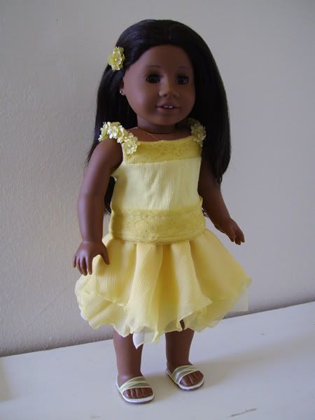
Flapper inspired dress by Allicapri
In Second Place:

Civil War inspired bolero jacket and skirt by Firinel
In first place:

60s inspired paper dress by C.I. Fairfield

Flapper inspired dress by Allicapri
In Second Place:

Civil War inspired bolero jacket and skirt by Firinel
In first place:
60s inspired paper dress by C.I. Fairfield
Monday, April 5, 2010
Guest Judge Pick Round 2: Joan!
Well, I have to say it's much easier having 6 votes to spread around, rather than having to pick just one favorite! There are several outfits and a lot of assorted pieces that I would really love to have in my collection. It was a tough decision, narrowing it down to just one and after much debate, I chose C. I. Fairfield's 60's inspired paper dress.
I never would have believed this dress was made from paper, it looks like crisp cotton. The style is very wearable for a modern girl, she would look dressed up but still be casual enough to run and play. The colors are lovely and the contrasting green trim really makes the the whole outfit pop. The charming little flowers add just enough interest without being distracting and the cute little sandals are the perfect finishing touch. Just looking at this outfit makes me smile and think of Orange Creamsicles and happy, little girl summers!
I never would have believed this dress was made from paper, it looks like crisp cotton. The style is very wearable for a modern girl, she would look dressed up but still be casual enough to run and play. The colors are lovely and the contrasting green trim really makes the the whole outfit pop. The charming little flowers add just enough interest without being distracting and the cute little sandals are the perfect finishing touch. Just looking at this outfit makes me smile and think of Orange Creamsicles and happy, little girl summers!
Sunday, April 4, 2010
Bit of a Delay for Round 2 Results!
There may be a bit of a delay for the Round 2 voting results.
There already was, due to Easter Family time, but then I broke my delete key, while finishing up with the critiques. I spent too much time trying to fix that, and now I have to go to work. Sorry about that!
There already was, due to Easter Family time, but then I broke my delete key, while finishing up with the critiques. I spent too much time trying to fix that, and now I have to go to work. Sorry about that!
Subscribe to:
Posts (Atom)
