Before going into individual critiques the judges would like to take a moment to single out Simplicity, for their horrifically fitting patterns.
Nearly every outfit, both this round and last, that we thought has some fit issues, was made with a Simplicity pattern. While they hold the bulk of the blame, the judges do recommend test-runs with patterns. Making a muslin mock-up can help you preserve the changes you make, so that you can use the new, better-fitting, pattern again and again.
If you're lazy, we understand, but you can always take in the garment once it's constructed. This can make a dramatic impact to how the outfit looks on the doll, and suggest that you have a higher skill level (because you *will* have a higher skill level.).
CBSewsThis outfit looked a little too close to the original inspiration. A more modern fabric choice could have done a lot to update it and make it seem more wearable for a girl today; the brown paisley ages the look a lot. Brighter colors in addition to smaller elements, like accessories, would add originality, though the ribbons, particularly in the back, and the use of the sheer fabric over the base, add visual interest, though, and make it more memorable. We just would have liked to see that taken a little further.
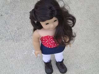
SarahAdding the tights was a really good idea; they bring the whole outfit together, and add to the 80's look, a look which happens to be very "in" right now anyway. Plus, the skirt is way too short, even for a mini skirt, but the tights reduce the potential for scandal. The polka dot pattern is a good scale for AG, but we think the top could have benefited from some straps. It's important to remember that the doll body is basically a rectangle, so things might not stay up over time. We also recommend taking a look at similarly constructed garments, even for people, before making something or considering the use of patterns (even simplicity, though again, pay attention to fit!). This can help you figure out how outfits are constructed for shape and support.
C.I. Fairfield/ChildthursdayLooking at this dress, you can't really tell it's made of paper, and not just a very stiff fabric. It also found a great balance between inspiration and copy. The pleats silhouette, and color seem appropriate today, while the use of material, pattern and general concept are a bit mod. The trim, in particular, was a very nice touch; comparing the before and after pictures shows what an impact just a little bit of ribbon can make. The fit on the top is a bit wonky, though we're not sure if that's the paper, or a plump Sonali. And also, if it is the paper, well, it's paper. We also appreciate that she made a pair of shoes, and compliment her styling for the outfit.
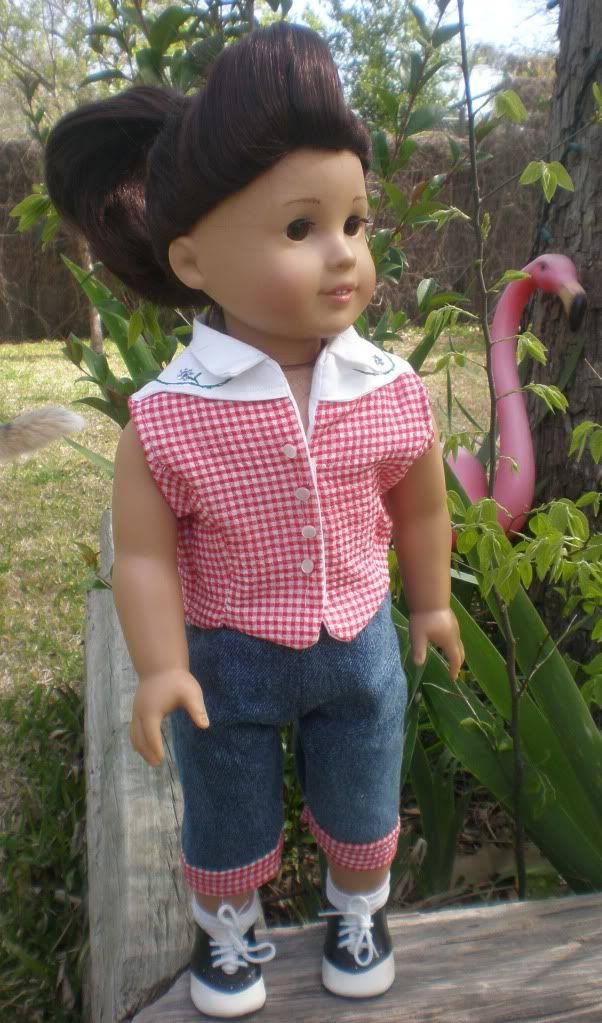
KittycatalinaThis is another one where a more modern fabric choice or color palette could have done a lot to update the look and make it less derivative of the original. Still, the styling is great, particularly the hairstyle, which is both period appropriate and super trendy at the moment. Technically, we wonder if this one was a bit rushed; the buttons are a bit haphazard, and the fit seems a bit bulky, perhaps due to the use of a lining over hemming? While washers aren't particularly innovative or original, they were used to good effect here, as flowers, with the appropriate leaf embroidery. The cuffs on the pants were also a nice detail.
FirinelThe skirt does most of the work for the outfit; the fabric is a great choice and the way it's framed by the pleats and brown tape at the hem uses it to its fullest potential. The Jacket coordinates well, especially with the repeated use of the brown trim (Bias tape?). That said, we think the simple shirt was a bit too safe. We think it needs just a little bit more, like a sleeve, or a collar, or a color. When the jacket is removed, the high waist *is* overwhelming, and the two pieces don't stand alone, though we suspect they could, while still looking fine with the jacket. The "untraditional" element was also a bit disappointing. Keys as a necklace aren't a new concept; these just happen to be in a good scale for AG's.
jchappaIndividually, the elements of this outfit wouldn't be out of place today, but we're not sure how well they work together. Leggings, or a less Celtic-looking embroidery may have helped update this more. We also wonder if a different color would have been a better starting point. The black looks a little washed out, and while it helps the embroidery stand out, it doesn't really coordinate with it. But, the lacework and the embroidery do look very nice, while the keyhole neckline adds some interest to the garment. The length might seem like an odd thing to single out, too, but this dress seems to fall at just the right spot on the model.
LJCatfeatherThe collar and color are good references to the inspiration, but other details, like the lines in the top, might have been overlooked if they weren't explained for us. They're also overwhelmed by the collar. The skirt, while expertly pieced together, seems incongruous with the Egyptian them. A narrower skirt, or even more of a tunic with the leggings, might have worked a but better, while still not being to referential. The collar's use of nontraditional materials works great though.
SewingmamaThis look has a lot going for it: there's a lot of pieces, and they're incredibly well made, the colors look really nice together, and the zippers provide an interesting effect. The weak point, though, is the brown fabric used in the skirt and coverlet; it's a bit too heavy looking, and the cover is a bit drab. We wonder if a richer khaki or even a gray might have helped. Or even a plaid or a print? Still, the other colors work well together, particularly the underskirt and the leg warmers (great use of variegated yarn here!), and even the brown doesn't look terrible, we just think it could look better. The criss-cross effect with the suspenders in the back was really eye-catching.
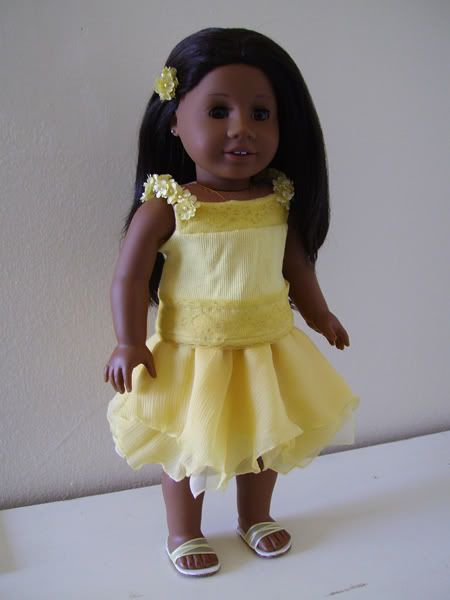
AllicapriThis dress doesn't look out of place today, but we think it's more because it's so classically beautiful, than that there was much updating to the original inspirations. We are fully aware how terrible it is when the real Project Runway judges say, "You made a gorgeous dress! How awful!" and we know this could *sound* a bit like that, but we don't mean it that way. Mostly.
Still, this does feel like an "Allicapri original". Mixing the textures in the same color works brilliantly, though it might have caused some limitations to the materials, such as the lace at the waist being perhaps a bit too heavy? While the use of fake flowers on a dress isn't revolutionary, the floral straps truly contribute to the impact of the dress.
SeaflowerThe red jacket almost references the inspiration *too much* but the rest of the outfit is just a t-shirt and jeans. Something like breeches-inspired capris could really have carried the look through the outfit, and allowed the jacket to be a bit simpler (maybe a cap sleeve) while still medieval-y. The fabric choice was very nice here. The red print looks modern, especially when combined with the black. Careful in posing your photos though, the way the arms are out makes us wonder how well the jacket fits, and the jeans have slight bit of cameltoe. Pressing the jacket could have also helped it look neater and more fitted.
Heritage4The styling, particularly the hair, really helps this look shine. Without the corset, the grey ribbed fabric and the blue fabric don't seem to blend well together, but the untextured white fabric really brings everything together, and completes the look. The gathering on the skirt is an interesting effect, but we're not sure if it achieved what it was going for. A slightly longer skirt might have helped the effect stand out, and we wonder if the unaltered skirt might have been made a little too short in the first place.
numberonekittyWe love that the shirt uses details, like the tiny neck and sleeve ruffles, and the lacing to really reference the original time period, without overwhelming a modern outfit, but wish we would have seen similar in the capris. Choosing capris over shorts or pants was a start, since they're sort of like breeches, but a cuff or button or something at the bottom could have been really clever. The purse, while it was an original use of materials, but it doesn't seem to go along with the rest of the outfit. We get that kids won't really coordinate their purses with outfits, but the "unconventional use of materials" seems like a bit of an afterthought.
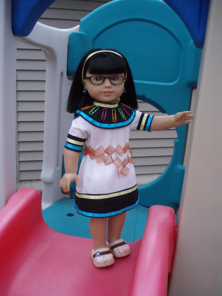
HolleyThis look is a little too costume-y, and we have trouble picturing a 9-13 year old wearing it to school, with the exception of the belt, which is pretty on-trend and modern looking. The neon colors do look really great on the black and white though bending the paperclips somehow might have been better, since they still look like paperclips. Choosing to edge the black collar was a good choice. Hemming might looked a little cleaner, but it also might have made it too big, or affected the way it hung, plus the circle shape would have made it difficult. Pressing the outfit might help in the future. The fabric puffs out around the seam in the back, which affects the way the rest of the outfit hangs.
StellaKellyLots of pieces, here, which suggests a lot of work, but there's a little too much going on. Editing it a bit might have been a great idea, since a lot of the pieces look really great when you focus on only that piece. A third major color, or replacing the orange or red with a color further away on the color wheel, could also have helped visually separate the pieces from each other. We do like the way the bright blue, in the flowers and glasses works with the red.
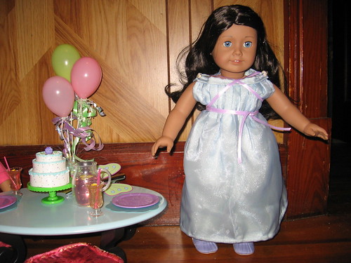
GomunkWhile this is a very pretty dress, it seems more like a dress-up outfit than anything a girl would wear, even to a formal event, like as a junior bridesmaid. The blue overskirt brings to mind Cinderella, though the ribbon edging looks great. More details like that, and the lacing and the beading, could helped modernize this. Changing the sleeve from the pattern was a good idea, but we think you could have taken it even further, by removing the sleeves altogether, or shortening them. The neckline is one of the dress's more modern detains, but its wide shape combines with the puffy top of the sleeves to make the doll look really wide in the shoulders.
thelight139 The judges did a lot of back and forth on this one! Similar looks were really popular in the 80's, but those looks were themselves inspired, even if loosely, by Regency fashion. The high waist, white eyelet and short spencer jacket were all things that were popular back then and have resurface to time, which this outfit makes good use of, but we wish there was a bit more of the designer in it. The pop can tabs were innovative and original, but other details, like contrast stitching in the jacket or dress could have really made this stand out more. Still, the dress fits well, and looks very nice on the model.
the1butterfly This has a really original inspiration, but we wish it looked a bit more modern. A different color/fabric choice or a shorter skirt could make this a fun easter or summer dress. The top, especially with the versatility of different sashes, though is interesting and very pretty, though the bottom and back could have used more pressing. The untraditional material was way outside of the box, but it doesn't seem to add much to the look. We also question whether human body parts are ever appropriate for clothing, being reminded of the time one of the Project Runway contestants used hair in their in their final collection. It's almost a little too strange.
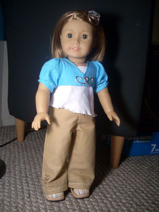
prncssmeOn first glance, this is a classy, simple look, but the details are what really make this shine, though they're almost too easy to overlook. The embroidery on the pants, and their very straight cut, for example, can be seen as a reference to pantalettes, once its pointed out, though capri or flood length bottoms would have been an even clearer reference. The asymmetrical hemline of the shirt keeps it from being just another tank top. The wiring detail on the jacket also looks like part of the outfit, not just a random broach or jewelry piece, which brings in the hairpiece as more than just a headband.
CuriouserThe inspiration here is very clear, even if the process was a bit backwards. The colors look very well together, and grey and red aren't something you see together every day. The print, too, is just gorgeous, a great choice. The judges are disagreeing, though, on whether or not the overdress works best, as-is, in four panels, or if it would look better as a more solid overdress, though they agree that the skirt might be a smidge too stiff. The designer might have been going for an armor-look, but kids can be really sensitive to the way fabric falls around them, and dislike things on that alone.

